Logo design
Leather & Fetish Milano

LFM is reborn on the tradition of the Leather Club Milano (formerly IML-Italia Moto Leather), whose founders wanted to give their new support immediately to the new club.
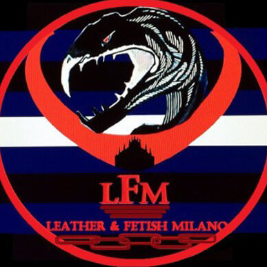
Our logo at first contained the stylized element that had been the symbol of the old LCM, that is the Duomo of Milan, to which was added the symbolism of the Fenice, because we liked the idea of representing the rebirth of a leather club in Milan after so many years of absence, just as the mythological bird rises from its own ashes. La Fenice then took flight over Milan, inside what was another strong symbol for us: the heart of the Leather Flag, though represented “open”, like two wings that wanted to welcome the whole fetish community, welcome to our Club in all its peculiarities and diversity of genres.
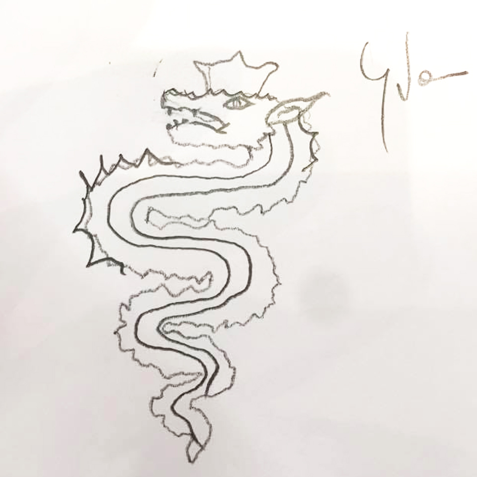
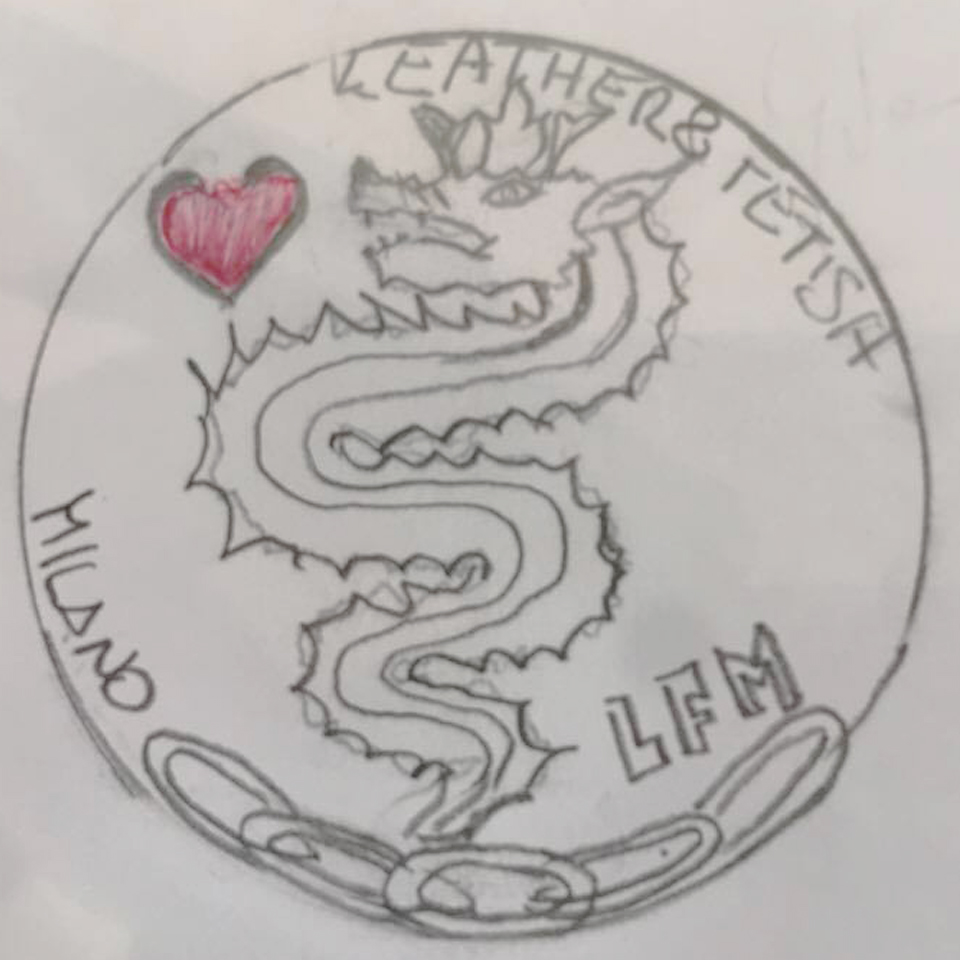
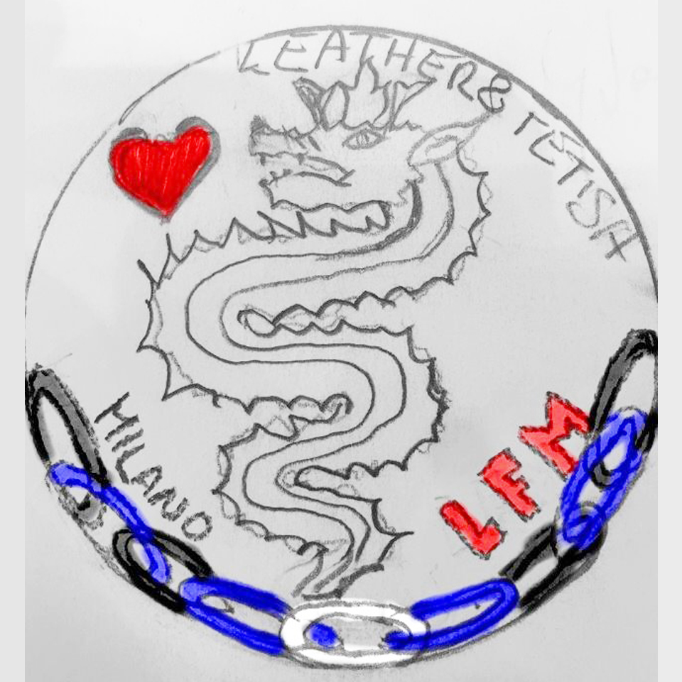
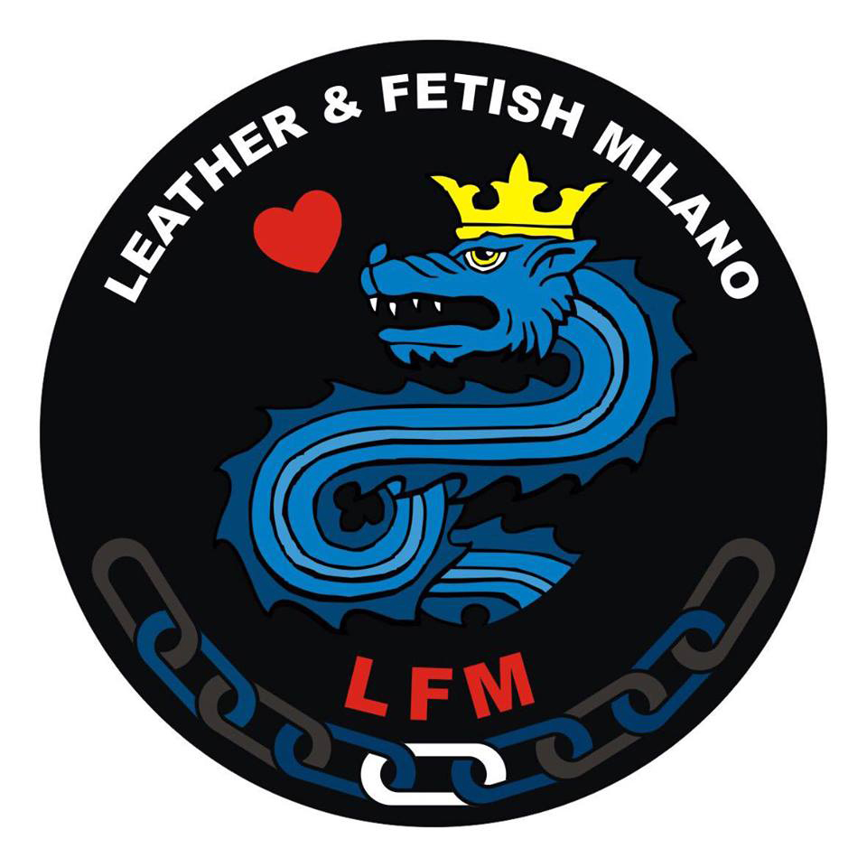
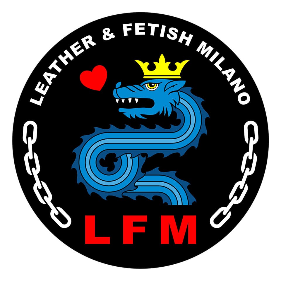
Later, we reworked our flag, of which we are now proud, translating it into one of the most ancient symbols of Milan and at the same time more “secular”: the Biscione (Visconti-Sforza emblem but already known before the communal age) which anyway it has always been radically married to the Fenice itself, as unruly symbols of rebirth, immortality and the union of the primordial elements of fire and air, of earth and water. And don’t forget that the Visconteo Biscione was also the symbol of IML.
Our blue Drag is therefore reborn to a new and multi-faceted life, and returns to protect and embrace (as did the Visconti biscione with the boy in its mouth) the red heart of our fetish passion.
Graphically the logo was designed and designed by Ivan Vareschi. The digitization was carried out by Hexy Joe and Stevio Blackhart.
